Monday 29 June 2015

Experiment Three: Marking the work of others

The Mission: Mark the work of two of your class mates and add it to your blog

[Marks for Marina Hanna]

[Marks for Janice Teng]


Experiment Three: Textures

The Mission: Create 36 custom textures based on 6 different movement words, then apply them to your model and run it through Lumion.


[Textures on my draft model]


Experiment Three: Final Submission

[The Mash-Up] 

Colour Guide: 
Dossier: Health Architecture Now - Architecture Australia May/June 2015
SILT - Architecture Australia March/April 2014
Urban Coffee Farm & Brew Bar - Artichoke Issue 47, 2014


Over the past two decades the city's major water supply has been rapidly rising. Health facilities across Australia and architectural design twist and turn on their way through Suburbs, a relaxed, shady oasis across all scales of development. The design challenges are significant because the logistical aspects of the project, including requirements for electricity, wheelchair access and lighting completely disconnect the city from high-quality healthcare, patients and staff. The river is the lifeblood of the centre of a bustling city where access to the shoreline is easy despite the increased reliance on prescribed organisational patterns and layouts, generating a new landscape for the visitor. The devastation of the floods allow educational components and open spaces heading downstream to highlight key aspects for the future and to note where architectural design provided well proportioned spaces for individuals and groups to meet, refresh, chat or just get caffeinated. This advance has been driven by the application of evidence-based design; the building is shaped by more than idealistic notions of "place". The jury praised the design team's clear and considered use of increased risk of fear and the replacement or relocation of key elements. The jaunty colouring of the installation created a welcoming environment superficially, it is perhaps even out of context. Form, material and detail give little clue to the building's function: this integrated approach to declaring the hospital's civic presence and public role reinforced the importance of expertly brewed large-scale development. 

The Theory: Destruction allows us to create, in hindsight, public spaces that are designed to seamlessly integrate into the public platform. In doing so, these spaces become indistinguishable in their function and ultimately allow for a more communal space.


[18 Perspectives]


[36 Custom Textures]


[One Sketchup Model]


[4 Real Time Captures of Draft Environments]


[5 Real Time Captures of Developed Environment]
Final Building

Final Building


Moving Element One: The Lift

Moving Element Two: The Tutorial Pods


Moving Element Three: Leuvers


[One Fully Developed Lumion Environment]
https://www.dropbox.com/s/k8p6lbuexqq7iby/EXPERIMENT3_ARCH1101_PERKSAmber.ls5?dl=0

A Study of the Red Centre


Wednesday 3 June 2015

Experiment Three: Sketches and Ideas

Backwards: an indication of how I am looking at this task. Instead of starting at the logical beginning - "Where am I going to start this thing?" - I have decided to start at the end - "What will my final product be?". So, as a logical way to organise a not-so-logical idea, I have indeed begun at the end: my final photos that I will submit as part of my folio.

[My plan for the final photos]


Of course, in order to decide what these photos will look like, it was nessecary to develop a 'plan of attack' for the project. 

My concept revolves around fragmentation and the rearrangement of space to create a building that are conducive to public/private mixed zones. I have chosen to break down an existing architecture school to create on that has a better circulation and interation between people: The Red Centre at UNSW.

[The exterior break-down]


As you can see, I have decided to appropriate the existing skin of The Red Centre to create a decontructivism-style building that lets in light and allows for movement. 

The interiors are, of course, based on the interior spaces in The Red Centre, in particular levels 5 and 6, where balconies allow areas to look down upon each other. This techniques has been employed in my public spaces, as these are the areas in which I want everyone to interact.

[Internal look down]


[Primary Sketchup Model]


Thursday 28 May 2015

Experiment Three: Deconstructivism


The below images all reflect the concept of deconstructivism. 


source: http://rachelcallender.blogspot.com.au/2014/06/deconstructivism.html


This image shows the way a structure can abruptly protrude from an existing building. I am not sure that this is the approach I would like to take with my building.

Automated Deconstructivism Matching Perspective in Different Images. Worth watching the video.
Source: http://raphdamico.tumblr.com/post/908660434/automated-deconstructivism-matching-perspective-in

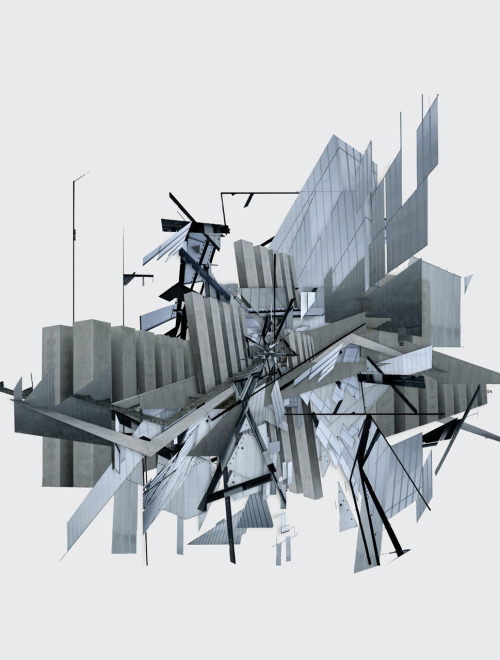
A drawing showing an exploded and modified building, bent and folded, stretched and expanded. How do the spaces in the red centre stretch and expand and fold and bend to become something as obtrusive as this?

[Spaces]
These images show distorted spaces that encourage the movement through them... 

20120220-215417.jpg
Source: https://designbyholly.wordpress.com/2012/02/20/deconstructivism-concept/

...they create hiding spaces...

Herta and Paul Amir Building of the Tel Aviv Museum of Art by Preston Scott Cohen

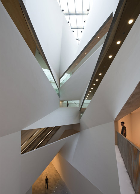
Source: http://www.dezeen.com/2011/11/22/herta-and-paul-amir-building-at-the-tel-aviv-museum-of-art-by-preston-scott-cohen/

... and places to view.

[Presentation]

There is a certain 'grunge' that goes with presenting some of these ideas, an idea of decay...


Source: http://www.guggenheim.org/new-york/collections/collection-online/artwork/5312
Gordon Matta-Clark, Photomontage early 70s


Source: https://www.pinterest.com/pin/92816442294433133/\

...and an idea of putting things back together, in a way that you wouldn't expect. 

The lighting in these pictures is distinct: Black on white, straight beams of light that cut through the space and draw the eye... 


Wednesday 27 May 2015

Experiment Three: The Plan

TO UPLOAD: 
Hand drawn ideas of layout - Try to overlay plan on model
Images of the Sketchup Models I have made so far


The Mission: choose a plan from the lecture on Thursday the 21st of May and use it to develop your work. You should use it as a basis for a section through the building/school. 

[My plan - Zaha Hadid: Irish Prime Minister's House]


source: http://www.architectsjournal.co.uk/culture/alvin-boyarskys-collection-of-art-works-on-display-for-first-time/8669888.article

I chose the above plan as a basis for my own section because it introduced some interesting ideas for me: The idea of a private space imposing upon a public one, intersecting it and interrupting it; the combination of linear and nonlinear form which creates a cohesive space; and the use of irregular shapes. These three ideas, in my opinion, add to my concept of destruction and fragmentation as a means to create public/private spaces that are versatile.


[Plans of a fragmented trifecta]


[Draft Lumion Model]


[My Musings]
Below are the original hand drawn ideas that I have come up with in regards to the layout of my building. I have decided that separating the building into five parts would be the most logical and useful way to configure the layout.

As you can see, I built upon the idea of 'destruction' in order to come up with some ideas for the aesthetics of the building. Now, it seems, my focus has changed from five elements - flood, fire, avalanche, drought, and storm - to one: crumble. 


The moving elements in my design have therefore changed.